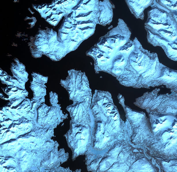
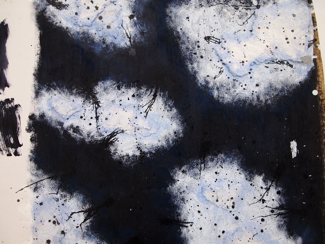
For my response to the Surfaces and Background pieces i have looked at, i re-created a satellite image (shown below). I used blue and black acrylic paint mixed with sand to create the background. This created a rough texture . I then 'dusted' over this with a deep blue chalk, that created blue highlights in areas of the dark background. I used the a light blue acrylic paint, applied with a sponge, to create the overall shape of each section of land. Then i used handmade paper to add an almost 3D effect for the rougher, raised areas of land. So, overall, using these materials has resulted in a heavily textured piece which was an important aim for this study. I'm relatively happy with my piece however, if i was to do it again (or add to it), i would make each section of land more complex, making them intertwine in areas and maybe overlap/join up.
The colours used in the piece are natural; brown, green and white. This could suggest that the artist was intending to create a scene of nature. It looks as if the paint (the white) has separated, creating the sections, however i'm unsure of the artist's technique. The sections are large at the bottom of the piece and get smaller as you look further and further up, until the point about two thirds up the piece where they appear to only be dots. A new pattern then starts that is a lot smoother and simpler.
I like how the white, particularly in the middle of the piece, stands out as the brightest feature against the dark brown and black. The green in the top right hand corner is also quite prominent, making the piece look a lot more vibrant. "Nature is better at painting than i am." According to various websites, the artist uses an aluminium panel which he soaks in acid for these paintings. He then pours substances such as ceramic glazes, stained glass window paint and resins onto the surface, allowing them to interact. He said of the process "basically doing exactly what it says not to on the back of the packet". This process is completely unpredictable, which in my opinion is why the outcome is so special. The painting, to me, looks like a satellite image of the earth. The varying shades of blue give the appearance of the ocean, reflecting the different depths (the darker areas being the deepest). The white looks like clouds and the green/brown areas land. There is such an extensive variety of colour within the piece that, from afar, you could assume it is a photograph. Below are three other nature paintings by Tyson. (surfaces and Backgrounds) Jan Kath - Erased Heritage collection - serapi queensbury aerial9/9/2014 As soon as i saw this piece, i fell in love with the idea that the artist has taken a classic idea, something that we all recognise as a specific object with a specific 'look' or 'theme' surrounding it, and has turned it on its head. The oriental-print carpet has been obscured by the orange 'alienation effects' (a phrase they are commonly referred to) which are a trademark feature of all of Jan Kath's designs. The orange, when looking at it on a picture (as above), looks as if it has been sponged on. However, in real life, im sure the media used is entirely different. The majority of the other designs from the Erased Heritage collection that are shown on her website are said to be made of wool and silk, however i'm not sure if that applies to this specific piece. Also, i dont know if the wool/silk is referring to the carpet itself rather than the "alienation effects" on top. I like how the intricate patterns of the carpet are still clear, as a pattern that beautiful shouldn't be completely obscured, but is also hidden in areas where only minor segments are showing through. The design could also have a shock effect on some people. The pattern has been covered in places which may seem obscene as it doesn't reflect the way these carpets are meant to look traditionally. In my opinion, a piece having a shock factor makes it successful in that it rouses emotions. Below are other examples of pieces from Jan Kath's 'Erased Heritage' collection. Here are some of my own markmaking pieces. All three were created using ink: for the first two the ink was applied with frayed rope and for the third picture the ink was applied on wet paper and left to spread/drip
Of the three markmaking pieces I have written about, this is my favourite. I'm a fan of pieces that are created using only black and white, as it allows the details of the piece (which are most important) to stand out, rather than all of the focus going on the colours used. The details in this piece are extremely intricate. From the scribbles in the center and the long strokes spreading outwards, to the larger drops and tiny splatters, there is a huge variety in ways the media is applied and therefore a variety in thickness, length and sizes of the marks.
The white paint (i'm guessing as i'm currently unsure of the media used) on the black background creates a stark contrast. The way the white is applied looks as if the artist intended to start in the center and spread his marks outward. The center marks are more collected and close together, and as you look further outwards, they become more free and spacious. This gives the effect of an explosion, perhaps. The longer more spread out marks are what gave me this impression. Synthetic polymer paint, crayon, and cut-and-pasted paper on paper, 48 1/2 x 38 3/4" - 2001
This piece caught my attention due to the amount of colour in it. I think the artist intended this as he has used a lot of yellow which is an obvious colour to choose for a bright, interesting piece; also, the contrasting deep purple/pink adds to the vibrancy, making the piece stand out. Various layers can be seen in the piece, which is why it looks rather complex. The top layer (or perhaps just one of the most obvious layers) is the pale pink and white streaks that run vertically. I think the yellow and deep purple/pink behind these white streaks are what give the piece its wow-factor. I like how the majority of the piece is covered in colour, so the surface (paper) rarely shows through. A piece can be attractive in a simplistic way when an artist purposefully has the blank background showing in large areas, however i think with the technique Twombly has used to apply his media, the more the better. 24in x 19in, ink and watercolour, 2003
This piece by Hambling caught my eye due to the spontaneity of her painting technique (as with the majority of her works). The marks she has used to create the piece are very 'free', as in the face appears to be made up from wiggly, irregular lines. Due to this, the features of the face are subtle. I like how the colours used are all of the same shade; black and grey, and how they contrast with the white background. This makes each individual stroke stand out, which is important so the technique is distinct. The darker areas create the shadows giving the piece a detailed 3D effect, which is what brings the realism of Berger's face out amidst the 'chaos' of the wiggly brush strokes. By looking at the technique, i assume the piece wasn't planned. I can imagine it was a spontaneous portrait of a live model; John Berger himself. |