


Here are the images from the previous post once i applied the 'Stamp' filter. Playing around with the light/dark balance allowed me to select the right amount of white area that is sufficient to look impressive, yet isn't too complex when it comes to cutting it away. My favourite of the 4 is the greenhouse roof. I'm not too impressed with the stair shadow one as the white area in the top right corner will all have to be cut away, so it will be a waste of space on my print.
Our project theme for Linoprinting is architectural elements of the college building. We took our cameras and walked around the college, looking for window structures, shadows, reflections etc that would make interesting 15x15cm pictures to create prints from. Shown above are my images, which i have increased the contrast and shadows on to intensify the structures. Now i plan on going to photoshop and using the 'Stamp' filter to almost cartoon-ify the images, which will make it easier to work from when i begin cutting my lino
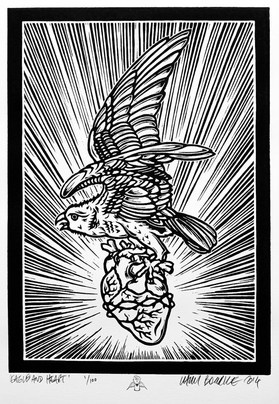 This print by Chris Bourke is eye catching because of the way the lines behind the bird and heart look almost like an explosion. Towards the centre, the lines have faded away to white and on the outside, the lines are thicker and black. I also like how the thick black border around the sides gives it a poster effect; almost cartoon-like.
The way the piece has been printed in black and white is what makes it so eye catching. Every different section of the piece contrasts with the areas around it, this is why i'm such a big fan of black and white pieces; the simplicity of it is what makes it all the more appealing, and makes the details stand out. It isn't an intensely intricate piece (as in, for example, the bird doesn't look realistic as it would in a photograph) but the thick outlines of each feather and the small marks on its body that represent the creases of its skin etc make it really effective. | AuthorWrite something about yourself. No need to be fancy, just an overview. ArchivesCategories |


 RSS Feed